Choosing the Number of Colors When Tracing an Image to SVG
Of all the sliders on a tracer, Colors changes the result the most. Too low and parts of your image vanish. Too high and you get stray shapes and a heavier file. Here is how to pick the number on purpose instead of by feel.
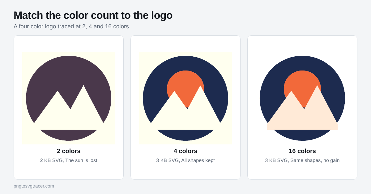
What the slider actually does
In the SVG tracer, Colors is the most colors the trace may use. It is a ceiling, not a target. The tracer reduces the image to that many flat colors, then draws one set of shapes per color. On a flat image it will often use fewer than you allow.
That is why the same logo at 4 and at 16 can come out nearly identical. The slider runs from 2 to 32.
Count the colors first
Look at your image and count the flat colors you want in the SVG. A navy circle with an orange sun and cream mountains on a white page is four colors, because the white counts. If you plan to remove the background, you can count it out, but the safe habit is to include it and clean it up after.
Set Colors to that number. For most logos this is the whole job.
What too few looks like
The tracer merges the closest colors first. In the figure above, the 2-color trace turned the navy circle and the orange sun into one dark shape, so the sun is gone. Mountains still look right because cream against dark is a big difference.
Signs you went too low:
- A shape that should be a different color has blended into its neighbor
- A small accent, like a sun, a dot or a highlight, has disappeared
- Two shades of the same hue have become one flat color
Fix it by raising the count one step at a time and watching the comparison slider until the missing shape returns.
What too many looks like
On a clean flat image, extra colors do little harm, as the 16-color trace shows. On anything noisy, they do real damage. A JPG has a soft halo around every edge, and each blended halo color can become its own thin shape if you leave room for it.
You will see:
- Pale outlines along edges
- Tiny islands of an in-between color
- A file that is larger than it should be
The JPG logo settings guide shows a case where lowering Colors from 8 to 4 took a trace from 83 KB to 13 KB and fixed a wrong-colored shape at the same time.
Rules of thumb by style
| Image | Starting Colors |
|---|---|
| Two-color logo or icon | 2 or 3 |
| Brand logo with accents | Count them, plus 1 |
| Flat illustration | 6 to 12 |
| Shaded illustration | 12 to 20 |
| Photo (posterized look) | 24 to 32 |
These match the presets. Logo starts at 8, Illustration at 16 and Photo at 32. They are starting points, so change them after you look at the preview.
Use Black and white for single-color work
If the final piece is one color, such as vinyl, a stencil, a stamp or a laser cut, skip Colors altogether. Pick the Black and white style and set the threshold instead. You get clean shapes with nothing to merge. The stencil guide covers that workflow.
A quick method that works every time
- Drop the image into the vectorize image tool and pick the closest style.
- Set Colors to your count.
- Drag the comparison slider across the preview.
- If a shape is missing, add one color. If you see pale outlines or specks, remove one.
- Check the file size, then download.
Two or three passes is normal. If lowering Colors does not clear stray shapes, the problem is noise, not color count. Raise Soften and Remove small specks instead, as the jagged trace guide explains.
Colors and file size
Each color adds a layer of shapes, so more colors usually means a bigger file. For web use, the file size guide shows how far a lower count takes you. For gradients or photos, remember that this tracer makes flat shapes, so a smooth fade becomes bands. More colors make the bands finer but never turn them into a true gradient.
Related tools
Keep reading
- TutorialsBest Settings for Tracing a JPG Logo into a Clean SVGA JPG logo traces worse than the same logo as a PNG. These are the settings to change first, in order, and what each one does to the result.November 12, 2026 · 4 min read
- TroubleshootingHow to Make an SVG File Smaller: Fewer Points, Same LookTraced SVGs can get huge. Learn which settings shrink the file the most, what to remove, and how small a clean logo SVG should really be.November 9, 2026 · 2 min read
- TutorialsHow to Vectorize an Image in 5 Steps (Free, No Software)A step-by-step way to vectorize a PNG or JPG into a clean SVG in your browser, with the settings that matter and the mistakes that ruin a trace.October 22, 2026 · 2 min read