Illustrator Image Trace Settings Explained, Plus a Free Option
Image Trace in Illustrator has a long preset list and a panel full of sliders, and the labels do not say much. Most of the time you only need to understand four things: the mode, the number of colors, how smooth the paths are, and how much noise to ignore. Get those right and the rest rarely matters.
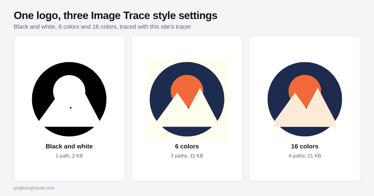
The presets in plain words
A preset is just a saved set of the panel's controls. Pick one, look at the result, then adjust.
- Black and White Logo, Line Art, Sketched Art, Silhouettes: one color of ink on nothing. Good for signatures, stamps, cut files and drawings.
- 3 Colors, 6 Colors, 16 Colors: a limited palette. This is the family for most logos. Start with the number of colors the logo really has.
- Shades of Gray: keeps tones as gray steps. Rarely what you want for a logo.
- High Fidelity Photo and Low Fidelity Photo: many colors, many shapes. Expect a large file that looks like a posterized photo.
- Technical Drawing: thin black lines, useful for diagrams.
The panel controls that matter
Mode. Color, Grayscale or Black and White. Choose Black and White when the final job is a single color, because every extra color is another shape you will have to manage later.
Threshold. Only in Black and White mode. Anything darker than the value becomes ink. If thin lines break up, raise it. If the paper texture turns into dirt, lower it.
Colors or Palette. The most colors the trace may use. For a flat logo, set it to the true count. More than that mostly adds thin halo shapes from edge blur.
Paths. Low values follow the pixels closely and give many points. High values give looser, simpler curves. If your trace looks lumpy, raise Paths. If corners get rounded off too much, lower it.
Corners. How readily a bend becomes a sharp corner instead of a curve. Raise it for logos with hard angles, lower it for hand lettering.
Noise. Ignores areas smaller than this many pixels. This is your speck remover. JPG logos usually need a higher value than PNG ones.
Method and Create. Abutting makes shapes that touch. Overlapping stacks them. Fills is what most jobs need. Strokes makes centerlines, which only suits very thin line art.
Ignore White. Drops white areas so you do not get a white box behind the logo. The same idea matters in any tracer, and the transparent background walkthrough shows how to check it worked.
A starting recipe for a logo
- Place the biggest, cleanest copy of the logo you have.
- Pick the color preset closest to your logo, or Black and White Logo for a one-color mark.
- Turn on Ignore White if the background should be clear.
- Set Colors to the real count.
- Raise Paths until edges stop looking lumpy, then raise Noise until stray dots vanish.
- Click Expand so the result becomes ordinary editable paths.
If it still looks rough, the source is usually the problem. See how to fix a jagged SVG trace.
The same settings in the free tracer
You do not need Illustrator to do this. The Image Trace online page has a table that maps each Illustrator control to its counterpart, and the SVG tracer runs in your browser, so the file stays on your computer.
| In Illustrator | In this tracer |
|---|---|
| Black and White presets | Style: Black and white |
| 3, 6 or 16 Colors | Style: Logo or icon, with the Colors slider |
| Threshold | Threshold |
| Paths | Smoothing (runs the other way: higher is looser) |
| Noise | Remove small specks |
| Expand | Not needed, the SVG is plain filled paths |
The two tools will not give identical paths, because each makes its own choices about the same pixels. That is useful, though. If one trace of a tricky logo comes out messy, trying the other is a quick second opinion. For a wider look at the options, read image to vector converter tools compared.
What neither tool will do
Both turn flat areas of color into shapes. Neither turns a photo into a clean illustration, and this tracer makes flat colors only, so gradients come out as bands. If your logo has a gradient, trace it with a few colors and add the gradient back in your design software.
Where to go next
If you are new to the idea, how to vectorize an image covers the whole process from start to finish. To keep the final file small, read how to make an SVG file smaller.
Related tools
- IllustratorTrace in a browser, with Illustrator Image Trace settings translated to these controls.
- SVG tracerTrace a bitmap into SVG paths with control over colors and smoothing.
- PNG to SVGTurn a PNG, JPG or WebP into an SVG you can scale to any size.
- Adobe ExpressHow Adobe Express converts PNG to SVG, and what to use when you want more control.
Keep reading
- TutorialsHow to Vectorize an Image in 5 Steps (Free, No Software)A step-by-step way to vectorize a PNG or JPG into a clean SVG in your browser, with the settings that matter and the mistakes that ruin a trace.October 22, 2026 · 2 min read
- TroubleshootingWhy Your SVG Trace Looks Jagged or Lumpy, and How to Fix ItWobbly curves, broken thin lines and noisy edges all have a cause. Here is what to change in a trace, setting by setting, to get a clean SVG.November 5, 2026 · 3 min read
- ComparisonsImage to Vector Converter: 6 Tools Compared (2026)Six ways to turn an image into a vector compared on price, privacy, output formats and who each one suits, from free browser tools to Illustrator.October 12, 2026 · 3 min read