How to Make a Monogram or Lettering SVG from a Font Image
Lots of people want a monogram, a name or a short phrase as an SVG, and they already have the letters as a picture: a screenshot from a font site, an image from a design app, a scan of a sign. You can trace that picture into letter shapes that a cutter, engraver or printer can use.
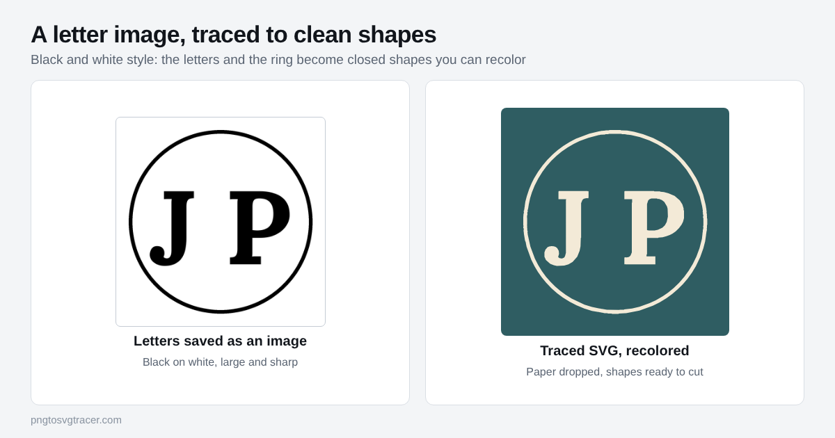
Start with a clean picture of the letters
The trace can only be as good as the image. Spend a minute here.
- Black letters on a plain white background. No texture, no shadow, no color behind them.
- Make it big. Set the text large before you take the screenshot or export. Letters about 1000 pixels tall give smooth curves. A tiny image gives lumpy edges.
- Export, do not photograph. A PNG straight from the app is sharper than a picture of a screen.
- Set the spacing before you trace. Once the letters are a trace, moving one letter means selecting and nudging a shape by hand. It is easier to fix in the font app first.
If you type the letters yourself, a bold or medium weight traces better than a very thin one. Hairline strokes can break into pieces.
Trace it
- Open the SVG tracer and drop in your image.
- Set the style to Black and white shapes. This drops the background and keeps only the dark shapes.
- Leave the Threshold near the middle. For solid black letters on white it rarely needs to move.
- Keep Smoothing low. Serif tips and sharp corners are the first thing too much smoothing rounds off.
- Use the comparison line to check the corners, the thin parts of each letter and any small details.
- Download the SVG.
For white letters on a dark background, tick the option to trace light shapes on a dark background instead.
The holes inside letters
Letters like O, A, B, D and P have holes. The tracer cuts each hole out of the shape around it, so the inside of an O stays open. You do not need to do anything. If you recolor the letter or send it to a cutter, the hole stays a hole.
It matters for two jobs in particular. On vinyl, the little center of an A or a P is weeded out, not left as a floating piece. On a stencil, the holes in letters need small bridges so they do not fall out, and a trace does not add those for you. Plan for it in the design, or pick a stencil-style font with gaps built in.
Scripts, overlaps and joined letters
Script fonts are where traces go wrong. Two things to watch.
Letters that touch. In a connected script, the letters join into one shape. That is good for a cutter, because the name cuts as one piece. If your letters only almost touch, a trace may leave hairline gaps or hairline bridges. Zoom in on every join before you cut.
Overlapping letters in a monogram. If two letters overlap in the picture, the overlap area becomes one merged shape, not two layers. You cannot pull the front letter off the back one later. If you need them separate, trace each letter from its own image.
Check it before you use it
Look at the SVG at the real size you plan to use. Then check these four things:
- The thinnest strokes are complete and not broken into dashes.
- Corners that should be sharp are still sharp.
- There is no box behind the letters, and no stray dots.
- Holes are open.
Raise Remove small specks a little to clear stray dots, but stop before it eats the dots on an i or a j.
Using the file
For a Cricut or similar cutter, upload the SVG and size it there. Logo to SVG for Cricut covers the upload steps. For a laser, a CNC or any tool that takes DXF, the shapes convert like any other path with SVG to DXF. If you ever type text directly inside an SVG editor instead, remember that live text is skipped in a DXF until it is outlined, as explained in why SVG text disappears in a DXF.
If your lettering is handwriting rather than a font, handwriting to SVG for engraving and mugs has the extra steps for uneven paper and light pens. The SVG for Cricut page lists the file settings that cutters like.
Mistakes that cost you time
Tracing a small screenshot. Start from the biggest version you can export.
Tracing a picture with a texture behind the letters. Texture becomes shapes. Remove it first, or raise the Threshold.
Using a font you cannot use. Many fonts are free for personal use only. If you will sell products with the lettering, check the font's license first.
Skipping a test cut. Cut a small copy on scrap before you commit to the real material.
Related tools
Keep reading
- TroubleshootingWhy SVG Text Disappears in a DXF (and How to Fix It)Converted an SVG to DXF and the letters vanished? Why live text gets skipped, how to turn it into outlines in Inkscape, Illustrator or Figma, and how to check.October 30, 2026 · 3 min read
- TutorialsHandwritten Notes and Recipes as SVG for Engraving and MugsTurn a handwritten recipe, note or letter into an SVG for engraving, mugs and cutting boards. How to capture it, trace it and fix the common problems.November 1, 2026 · 4 min read
- TutorialsHow to Convert a Logo to SVG for Cricut Design SpaceTurn a PNG or JPG logo into an SVG that Cricut Design Space can cut. Which style to pick, how many colors to keep, and what to check before you cut.November 4, 2026 · 4 min read